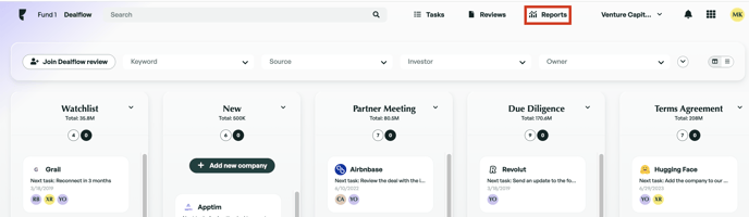
Funnel View
The funnel view in Dealflow provides an in-depth view of what has happened to your companies at each stage of your pipeline. Gain insights into the percentage of companies progressing through each stage and identify the stages where most rejections occur. Data in this section is sourced from each company's timeline.
Accessing the funnel view
The funnel view can be accessed from the Reports tab of Dealflow.
Funnel Page Overview
The Funnel view comprises three main sections:
- Set a Time Period: Customize the period filter. By default, it's set to the current month.
- Set a Comparison Period: Compare your pipeline between two periods.
- Filters: Apply custom filters to track pipeline progress based on multiple criteria. For more information on customizing filters, click here.
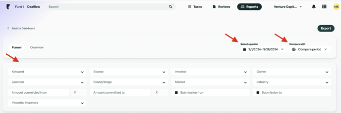
Note: The submission date filter shows information about companies created within the chosen period, while the "Period" filter shows information about the movements of the deals within the chosen period, regardless of when the deal was submitted.
- Export: Easily export your report to Excel.
Under the filters, you will find the funnel graph. The funnel graph displays visual and key details on how companies have progressed through your pipeline. On this graph, you can view:
- Period: Represents the current or the customized period.
- Investment Rate: Displays the investment rate percentage for the selected time period.
- Stage: Shows the total companies and their pass and drop rates at each stage.
- Source type: To view different source types in the funnel, click on the source toggle. Now, when you hover over any stage, you will see the percentage of deals coming from each source type.

Note that the number displayed on the funnel includes multiple submissions. So, if you create a second submission for a company, it will be counted twice.
As with most features in Edda, we aim to provide both a visual overview and an in-depth breakdown. Below the graph, you will find a table that lists each column along with its respective statistics. You can expand each entry to view details about companies that have passed through (in green), been rejected (in red), or are at the current stage (in black), and whether it's their first submission or not.

Comparing Multiple Time Periods
You can compare your pipeline from one time period with another by selecting a comparison period. When comparing there are a few notes to take into consideration.
- If your pipeline contained the exact same stages for both periods (No stages were deleted or added during that period), a single funnel graph will be displayed with a percentage displaying the difference between both periods for each stage.
- If stages differ between periods (Added or deleted a stage during the comparison period), two funnel graphs reflect both periods.
Exporting
You can easily export your funnel report to Excel by clicking the export button at the top right. When exporting your report, you have the option to customize it by adding a title, description, and logo.
Once you confirm the export, it will automatically be sent to the email account connected to your Edda.
Workflow and how it Impacts Your Funnel Graph
In the administration panel, you will discover the workflow plan. The workflow plan provides the ability to configure stages to match your Dealflow workflow. You can drag and drop stages to match your desired workflow. The workflow set out here will represent how your funnel graph is displayed.
Although the workflow is configured in the administration panel, you are still provided with the ability to reorder your stage columns in the Kanban view. When you modify the position of a column in the Kanban view, it will not affect the workflow or funnel graph. Changes made on the Kanban view are visual and will not affect the workflow.
Overview
This is the second main section on the 'Reports' page, providing detailed insights such as the total number of companies in your Dealflow, average time spent in the Dealflow, number of active and rejected companies, companies in the watchlist, the percentage of all companies represented by the watchlist, and more. You can click on each stage to view its data separately
Note that this section excludes multiple submissions. Every company is counted once.
Average Time Spent
Click the 'Average time spent' button to view data based on time spent in stages. Data is color-coded for clarity. Hover over any color to see the time spent, the number of companies, and the percentage this represents.
If you click on a color, additional details will be displayed, such as company names and time spent per company.
Below the column section, you'll find additional data and sections that enable you to analyze your data by geography, activities, team performance, and more. You can use the search bar at the top right of each metric card to filter the results, and you can also use the filters at the top to further refine your data.
- Total target fundraising by all companies: This is the total “Amount Next Fundraising” for all companies combined.
- Average fundraising: Take the total “Amount Next Fundraising” and divide it by the number of companies that actually have a value entered for “Amount Next Fundraising.”
- Funds to commit: This is the total “Amount to Commit” for all companies.
- Average to commit per company: Take the total “Amount to Commit” and divide it by the number of companies that have a value entered for “Amount to Commit.”
If there is anything you need further assistance with, please contact our support team on the platform, we are always happy to assist.